Olive Case Study
A responsive wellness web application app connecting health-conscious individuals directly to their healthcare teams and curated health resources.
Olive was designed to offer the reliability and convenience of health information storage and healthcare management, as well as curated resources for individual needs and goals —including habit trackers, health questionnaires, and programs.
The Problem:
While many wellness apps focus on specific areas of health services and resources, they often feel overly clinical or lack integration into daily life and personalized elements. Health-conscious users need a solution that allows them to manage all their health information and healthcare plans while providing access to easily digestible wellness resources. This empowers them to make informed decisions, fostering a holistic and sustainable approach to improving their overall well-being.
The Solution:
My primary goal with the Olive app is to serve as an interactive, all-in-one personalized hub that empowers users to make well-informed health decisions for sustainable living. Users will have access to the following features:
Users will have the ability to message and video chat directly with healthcare teams, with a multiple-organization option
Make and manage appointments
Store personal health information
Access lab results
Access habit trackers, programs, and questionnaires
Curated educational content
My Roles:
In February 2024, I participated in a course project for the UX Design program at CareerFoundry, where the objective was to apply newly acquired skills by creating a responsive web application.
Taking on the roles of UX/UI designer and UX researcher, I focused on user research to understand the features health-conscious users desired and the pain points they encountered with competitors. By refining my design decisions through extensive iteration, usability testing, and preference tests, Olive was born. The tools I utilized included Figma, Optimal Workshop, SurveyMonkey, and Lyssna
User Research
User Survey
Already having an idea of where to start but I needed a directional affirmation as I was unsure where it would lead me. I launched a user survey using a total of 21 potential users from varying demographic backgrounds to determine their current health-app usage patterns, needs, and preferences when it comes to managing and improving their day-to-day health patterns.
I first wanted to know the kinds of features my potential users want access to.
The top features indicated were:
Direct contact with their healthcare providers
Health information storage
The ability to schedule/manage doctor appointments
Mental health resources
Mood and habit trackers
Wellness plans
Fitness resources

User Interviews
Next, I interviewed 3 participants to build on my insights from the survey regarding user behaviors and practices when managing their health. The goal here was to gain qualitative data on what was missing from other health app experiences, and whether a holistic (physical, mental, and emotional) health approach to wellness management was a possible solution for maintaining long-term wellness sustainability.
Insights gained:
Users need a health app that highlights mental health tools and resources as much as physical health.
Users are looking for personalized health information.
The UI (aesthetics, colors, buttons, tone) of the app is the most important to users as well as the navigation.
Security and privacy of personal information is a consistent concern - Users want to be reassured of privacy.
Users want a balance of statistics, tools like mood trackers and quizzes, and engaging content relevant to their health needs and interests.
“I don’t want to download lots of different health apps for different things. It’s too much so I’d prefer having it all under one roof.”
“I feel like I fall behind on my health habits and doctor appointments that I use all my energy “catching up” which in turn burns me out. It’s a vicious cycle.”
“I would also like to learn more about the connection between physical and mental health. Like the way they work together synergistically. Can’t have one without the other, but there is still stigma around mental health.”
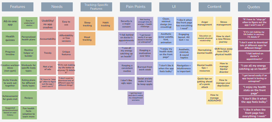
Affinity Mapping
Through the use of this visual tool in a brainstorming session, I was able to organize the qualitative data into different categories based on their relationships to one another. The patterns found in the data allowed me to plan for content and features to include once the designing begins. The categories are: Features, Needs, Tracking Tools, Pain Points, UI, Content, and relevant quotes provided by participants.
Card Sort
Now that I had the features I wanted to include, the next step was to find a way to best organize them. I wanted to discover how people would understand and categorize this information to ensure I create an information architecture that matches users’ expectations, so I recruited 6 participants to complete a card sort using Optimal Workshop.

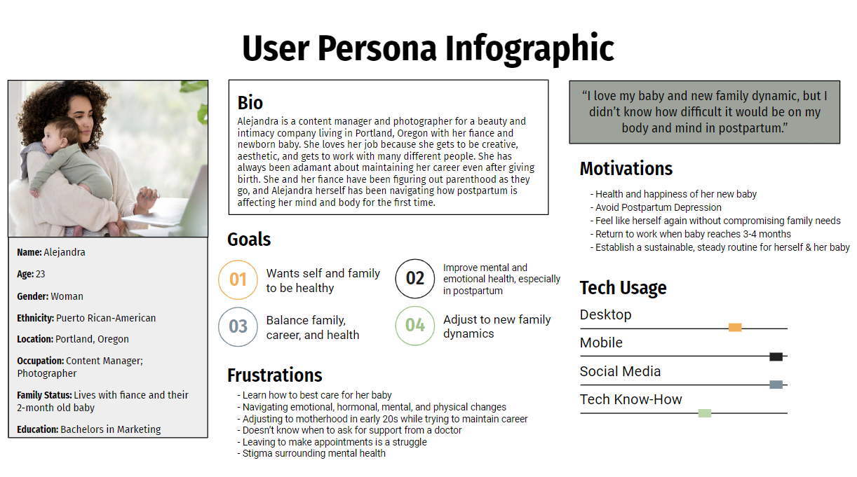
User Personas
Through the combination of user research and behavioral data gathered, I created two user personas to help illustrate the real-life needs, goals, and pain points associated with the target audience's experiences with wellness apps. Meet Alejandra and Malakai!

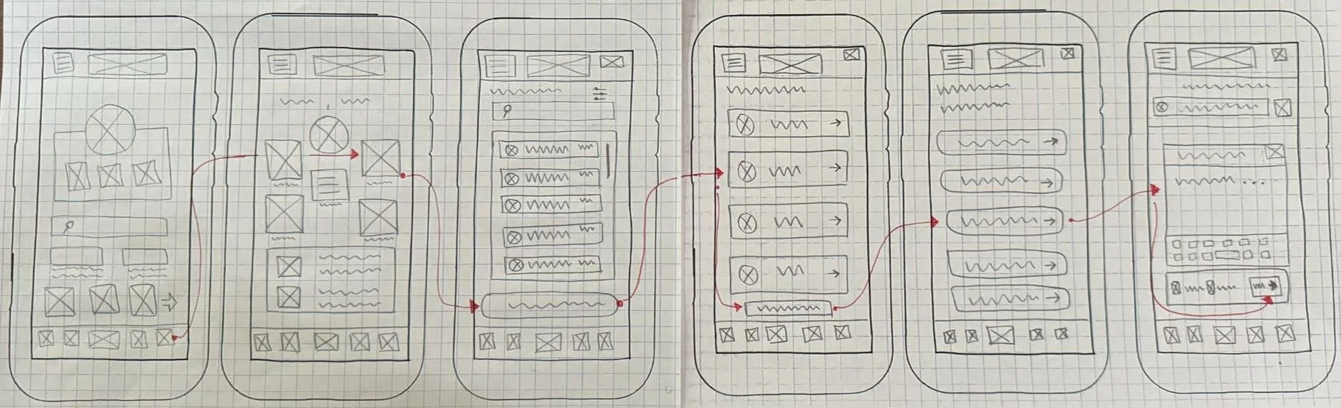
Wireframing
Design 1 - Onboarding & Sign-Up
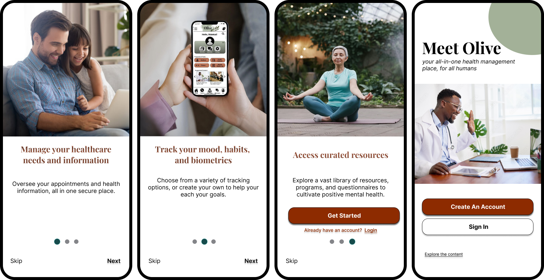
The goal of the initial sketch was to make the sign up process as straightforward as possible. I kept the initial design through mid-fidelity as I felt it was effective.
During usability testing all 6 participants had no issue completing the task of creating an account, describing it as “quick and concise.”
Through peer feedback and exploring accessibility inclusiveness, I improved the spacing so text wasn’t crowded and increased the font sizes to a minimum of 16px to make the buttons and links more accessible to reading and clicking. Comfortable clicking and viewing was confirmed by scaling the wireframes to an iPhone 15 Pro.
I also chose to add in an interactive onboarding flow to make the onboarding process more memorable and enjoyable by actively engaging the user, as well as showing off some of Olive’s key features before jumping in.


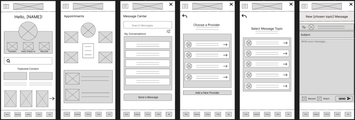
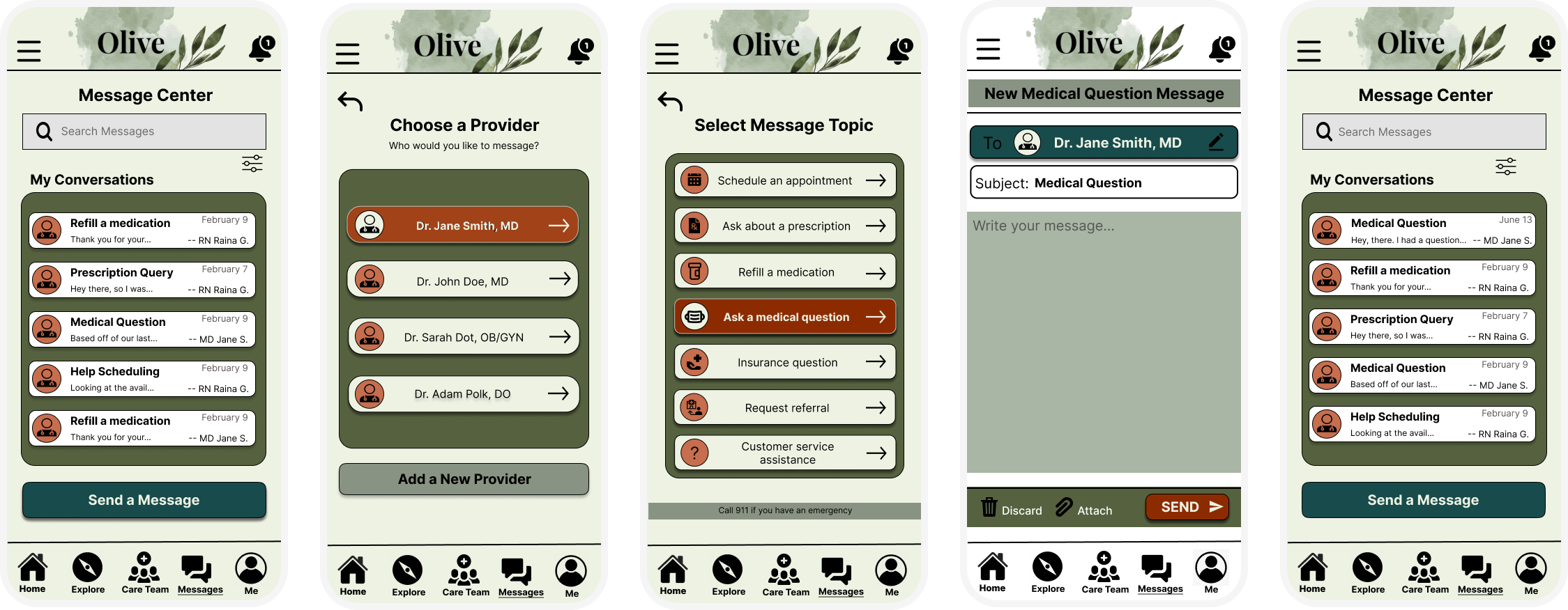
Design 2 - Sending a Message
My initial idea behind Olive’s messaging portal, and for the flow of sending a message to a healthcare provider, was to use the Visits tab > click Messages > Send a Message; however, usability testing indicated that this navigational flow was not intuitive.
All 6 participants defaulted to randomly clicking around the app in order to find the feature, which they eventually found by exhausting their options. 4 out of 6 participants reported not even realizing that messaging their healthcare team was even a feature offered.
To quell this issue, I incorporated a direct link to the messaging portal from the homescreen, as well as a notifications icon in the top right of the homescreen. I also provided alternate routes through the ‘Visits’ tab which was renamed and restructured as ‘Care Team’ in the high-fidelity iteration.
As the messaging feature is one of the most important features of this wellness app, and with the feedback from test participants, I ensured that accessing it was more intuitive and obvious.
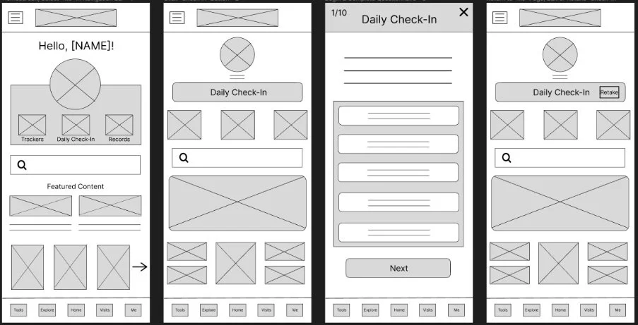
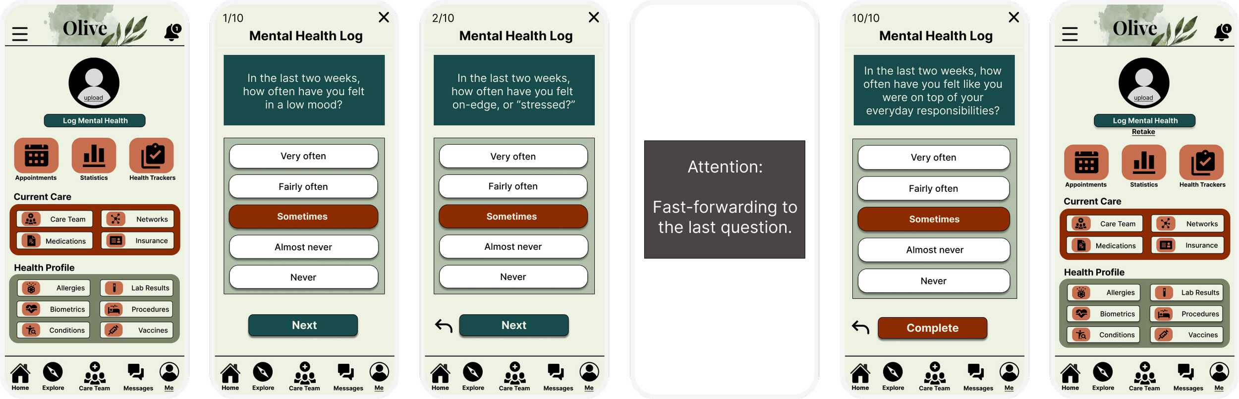
Design 3 - Launch Mental Health Quiz
This health questionnaire was designed for tracking fluctuations in mental health patterns through a daily or periodic check-in that asks the same 10 questions for consistent results over time, as well as insights. The initial navigational flow for this function was initially the Me tab > ‘Daily Check In’ button at the top > prompting the questionnaire.
However, every participant reported that this flow was not easy to follow because they all had to resort to aimless clicking around the screen to find what they were looking for, labeling this flow a high-level error severity score.
Feedback indicated that “Daily Check In” was ambiguous in wording, and 5 out of 6 participants thought this was an appointment check in feature. To improve this design I offered a direct link under ‘Programs and Tools’ which was added to the homescreen. Another route to reach this feature was through the ‘Me’ tab in the navigation bar at the bottom of the screen.
I also reworded the button as “Log Mental Health.” To improve the UI, I redesigned the ‘Retake’ option to make it easier on the eyes, moving it from a small text box to a larger text positioned underneath the ‘Log Mental Health’ button.

Feature Missed in the Conception of Olive
When asking my participants what their first impressions were of the mid-fidelity home screen in greyscale, 2 out of 6 mentioned that they expect guided meditations to be a feature in an all-in-one wellness app.
To my surprise, I realized that I had forgotten I used ‘Launch a Sleep Guided Meditation’ as a user flow for Malakai (one of my user personas) and didn’t design that feature for the prototype, even though it was meant to be one of the most important features.
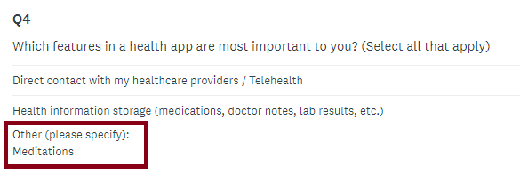
Participants from my initial user survey also indicated they wished to see guided meditations as a feature for Olive, but I missed it because it was a written-in feature under “Other (please specify):”
Having caught this design error through testing, what I did next was start over the iteration process to include a guided meditation tool.

Design 4 -
Launching a Guided Meditation
I wanted this flow and layout in particular to be especially simple because I would imagine when a user wants to start a guided meditation they may already have cognitive overload.
I didn’t include a bottom navigational bar, simply an “X” in the upper right hand side which will relay users back to the home screen.
The same concept will also be included with any tool feature (habit trackers, mood trackers, questionnaires, etc).
When moving from mid- to high-fidelity, I noticed some misaligning in the format, so I used a grid structure to bring the elements together in a cleaner, more balanced way.


Next Steps…
This is a continuous project that I’m choosing to build, so next steps will be to redesign the flow and conduct a preference test. Next, I’ll reach out to my network of peers and request feedback. Following, I’ll incorporate the feature into my interactive prototype and recruit participants for another usability test.