Study Muse Case Study
Study Muse is a responsive web application designed to help students build a supportive network for sharing study materials, ideas, and motivation. Focused on enhancing the user experience, the platform facilitates seamless collaboration and community building, empowering students to connect, learn, and excel in their disciplines through intuitive design and engaging features.
My Role:
UX / UI Designer
Project Duration:
4 weeks
Tools Used:
Figma
Design Criteria:
User-Friendly Interface: The goal is to make the app intuitive and easy-to-use so that students will be able to find what they need when they need it.
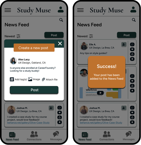
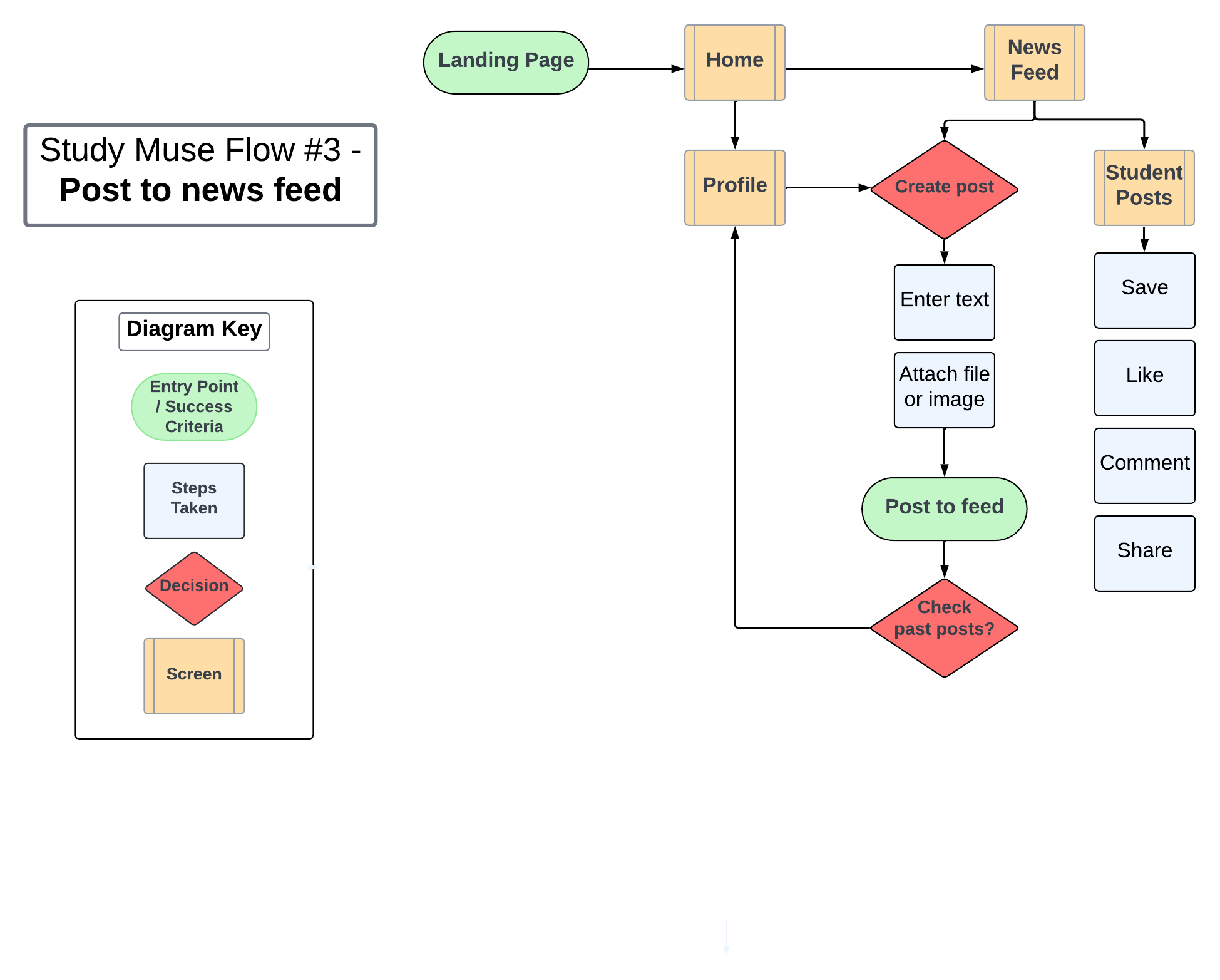
Key Functionalities: Students will be able to view and share study materials, tips, feedback, and resources related to their field of study through a community news feed. Students can find and form connections with other like-minded students with direct messaging and post interactions.
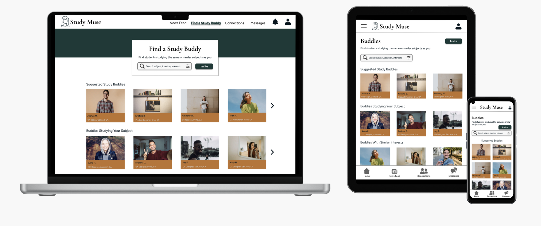
Filtering Options: Students can find other students by searching by subject, school, location, or interests; ability to invite friends.
-
Connect students online to facilitate peer-to-peer learning, support, feedback, and motivation.
-
Students need a way to sustain motivation and have access to new ideas so that they can succeed in their studies.
-
As enthusiasm and support are key proponents of learning, students can create a profile to connect, collaborate, and share support with other students in the same field of study. Sharing knowledge through a community news feed and direct messaging, students will have the resources and support they need to reach their learning goals.
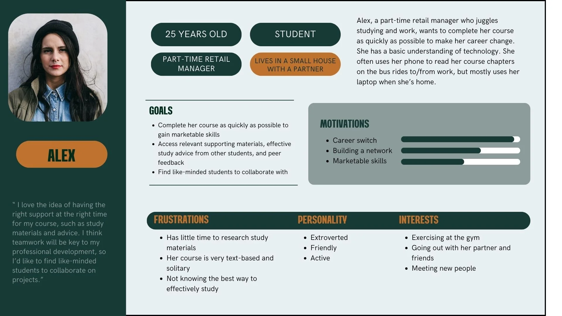
Who was I designing for?
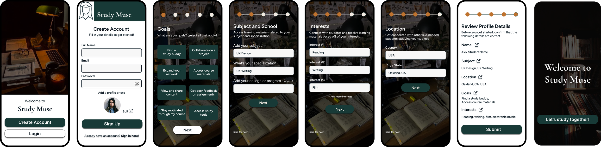
As a new user, I want to create a profile, so that other students can find me.

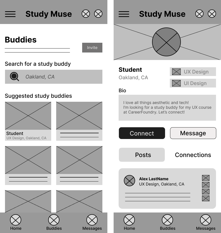
Wireframing
Wireframing
Wireframing 01

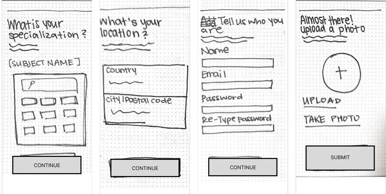
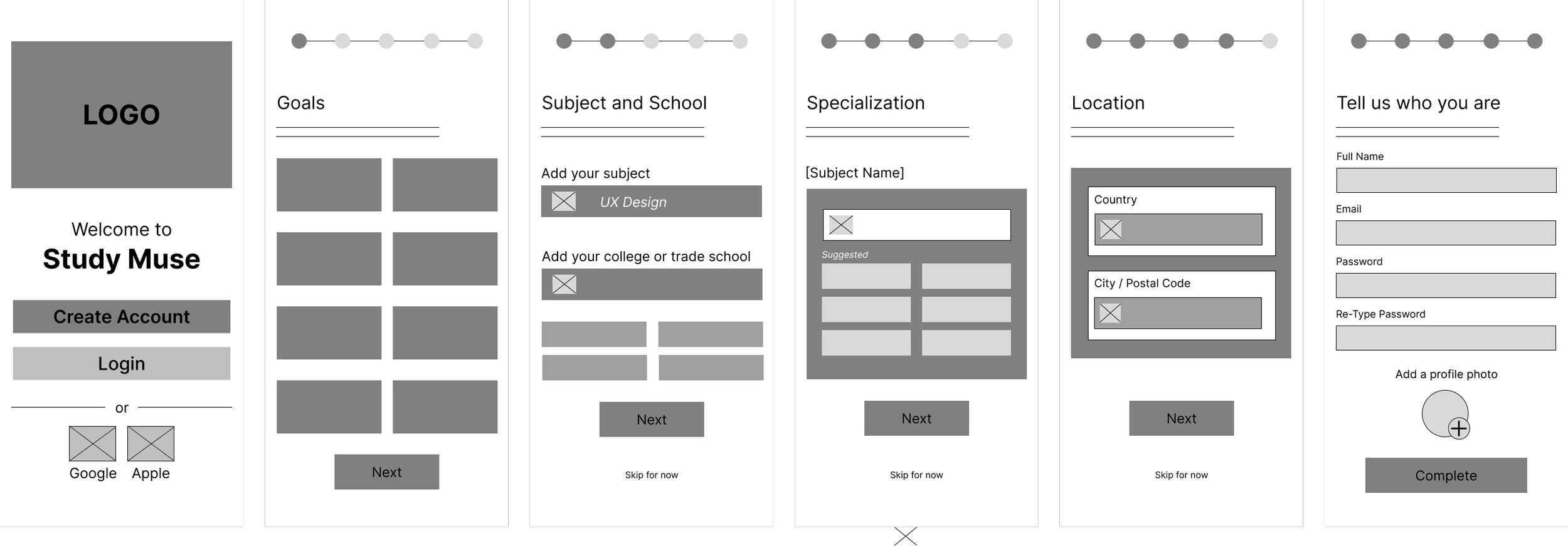
Wireframing 02
As a new user, I want to find and connect with students studying my subject, so that we may collaborate.
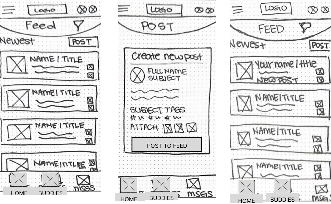
Wireframing 03
User Stories
As a new user, I want to find and connect with students studying my subject, so that we may collaborate.

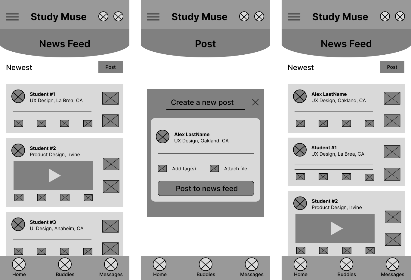

As a frequent user, I want to be able to view and share study materials, so that we can share knowledge.
As a new user, I want to create a profile, so that other students can find me.

As a frequent user, I want to be able to view and share study materials, so that we can share knowledge.

Visual Elements
Visual Elements
Mood Board
The Choices
The two mood boards are each intended to appeal to a particular student audience using the same three key words taken from the project brief: connection, knowledge, and inspiration.
Mood board #1 - A warm, inviting, academically-driven aesthetic for those who want to embrace a more structured, elegant, and intellectual experience.
Mood board #2 - A fun, vibrant, and active aesthetic reflecting a youthful, bright style for students who may want a more upbeat experience, potentially with a social media look and feel
Mood Board 01
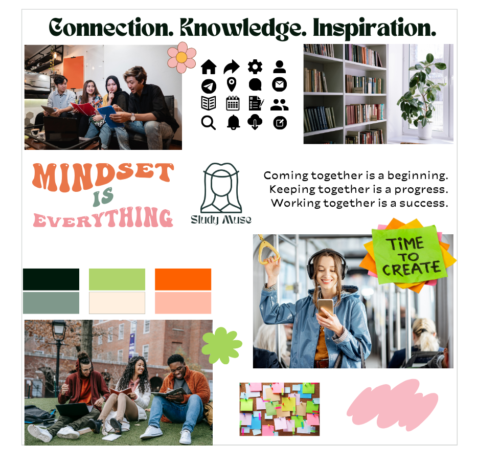
Mood Board 02
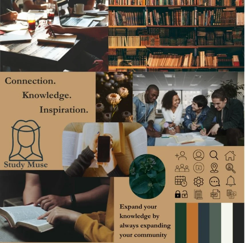
Selection: Mood board #1
I felt the first mood board aligned more with the project brief, appealing to curious, professionally growth-focused students who want to connect over their subjects of interest. The second board, while lively and eye-catching, may not produce a sense of reliability or maturity for users who are taking their learning development seriously and are using this app to make connections and achieve their academic goals. Mood board #1 displays familiar and welcoming imagery like books, warm coffee shops, and groups of engaged peers.
Typography
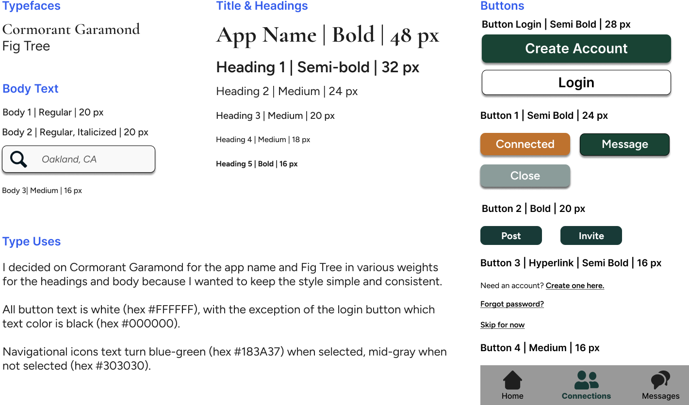
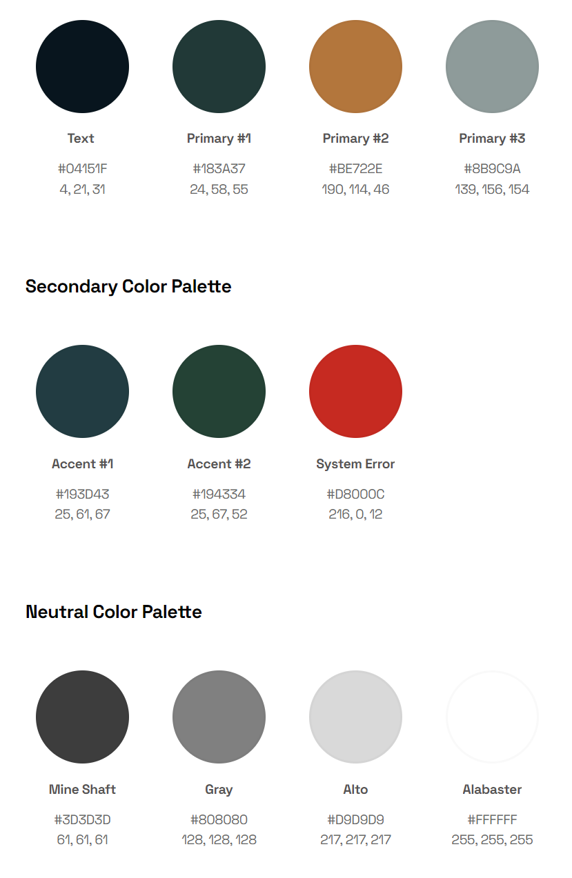
Color Scheme


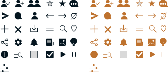
Iconography
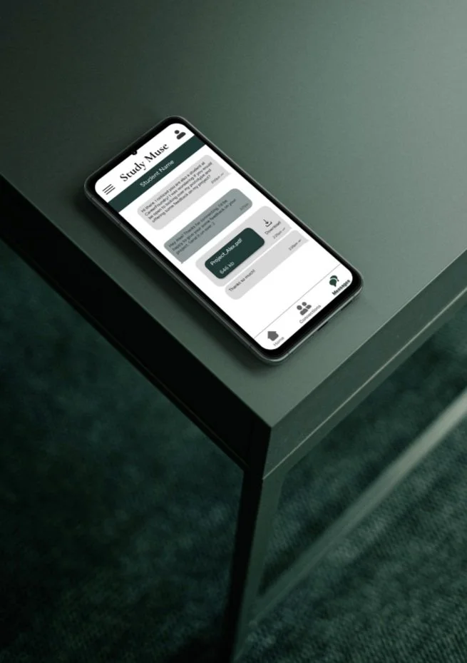
Designing for Different Breakpoints
As Study Muse is a responsive web app, I completed the project by adapting the screens for different devices and working off of a mobile-first approach to ensure the design stayed consistent in its responsive properties among mobile, tablet, and desktop breakpoints.